When used properly, donut charts can be an effective way to communicate comparisons in a unique way. When used improperly, they are the butt of jokes mentioned in the same vein as pie charts. In fact, donut charts are essentially pie charts with a circle in the middle, and in our data visualization tips series, I explain why you shouldn’t use pie charts.
So what’s the difference with donut charts?
One of my recommendations for practitioners that cannot quite let go of pie charts is to use five slices or less. Personally, I would not use more than two. When used for the specific purpose of showing a metric’s progress to goal, with one “slice” being the current state of the KPI and one “slice” being the remainder to goal, I think a donut chart works well.
I admit, a bullet graph would be the most efficient way to communicate the progress to goal scenario above. In other words, a bullet graph would be processed faster by end users than a donut chart and also take up less real estate on a dashboard. If you think a bullet graph may be a more appropriate choice for your data visualization, see How to Make Bullet Graphs in Tableau.
That being said, I don’t mind the extra real estate that a donut chart takes up because that space can be used to provide additional context in a visually appealing way. For example, you can place an icon that denotes what the donut chart applies to or a callout number that shows the percent your KPI has progressed to goal. Donut charts are an acceptable alternative chart type that can make your data visualization stand out. For more on making your work ‘remarkable’, see tip twelve in our Data-Driven Storytelling series, Balance Data and Design.
Looking to maximize the return on your company’s investment in Tableau? Learn about our Tableau TrainingW TO MAKE DONUT CHARTS IN TABLEAU
Step 1
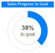
For the purposes of this exercise, we will make a gauge showing how our sales are progressing towards goal. I am using the Superstore sample data in Tableau. This data already contains a measure for ‘Sales’, but we will need to create one more field that calculates the sales goal minus the actual sales. The data you are working with may contain a measure for ‘Sales Goal’, but I am going to hard code a goal of $80,000,000 into my calculated field: $80,000,000 – SUM([Sales]).
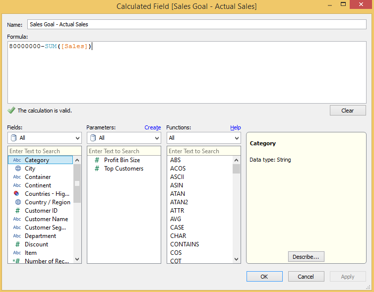
The reason we make this calculated field is so the two slices in our donut chart will always add up to the total goal, and actual sales will always by a correctly sized portion of the total goal.
Step 2
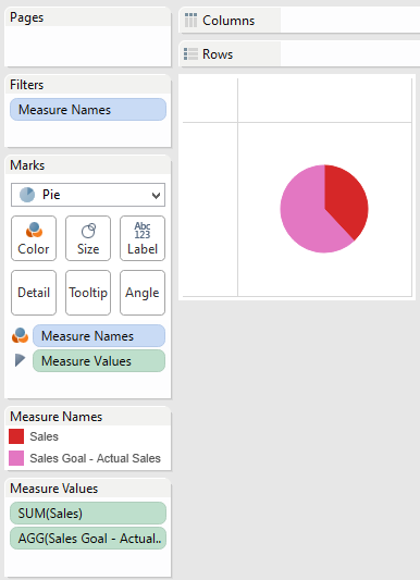
You will now create a pie chart using two measures: ‘Sales’ and the newly created ‘Sales Goal – Actual Sales’. Do this by first changing the mark type on your view to Pie. Now place ‘Measure Names’ on the Colors marks card and ‘Measure Values’ on the Angle marks card. Finally, filter the view on ‘Measure Names’ to only include ‘Sales’ and ‘Sales Goal – Actual Sales’. At this point, your view should look like this:
Step 3
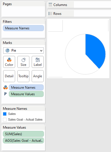
Format the donut chart (currently a pie) by increasing the size, adding a border, and most importantly: coloring the ‘Sales’ measure to a color of your choice and the ‘Sales Goal – Actual Sales’ measure white. This will eventually create the filling gauge effect we are going for.
Step 4
The final step in creating a true donut chart is to add your chart to a dashboard and float a circle with a transparent background over your pie chart. It is very important that you use a .png file so that your corners are clear and you will be able to see the underlying chart.
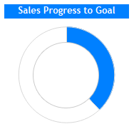
Feel free to use this .png file for your inner circle if you don’t already have one.

Finally, I mentioned earlier that I don’t mind donut charts because the real estate available in the inner circle can be used to communicate additional context either through icons or text. In this case, I may make a calculated field to determine the percentage of our sales goal we have obtained. This calculation can then be used to create a text sheet that can be floated over the donut chart to finalize the view.
Final Product
Source:
Hi Madhu,
ReplyDeleteIt was nice documentation and good effort can please elaborate deeply then easy to understand.
Hi Madhu,
ReplyDeleteCan you please explain how did you use the .png file in dashboard?
Ashok
This comment has been removed by the author.
ReplyDeleteI feel Tableau is the most useful and modern aspect through which many complex IT problems get solved.
ReplyDeleteTableau Soap Connection